GSAP ScrollTrigger | Start and End
Introduction
In this second part of the GSAP ScrollTrigger series, we'll examine the start and end properties.
In part one, we saw how a target element can be animated when a trigger element first enters the viewport.
But what if we want that target element's animation to start, for example, when:
- the top of the trigger element gets to the center of the viewport?
- the top of the trigger element is 200 pixels from the top of the viewport?
- the middle of the trigger element is 30% from the top of the viewport?
The start and end properties allow us to achieve this type of flexibility.
Accessing ScrollTrigger Properties
We'll start with this initial HTML setup for our example:
<!DOCTYPE html>
<html lang="en">
  <head>
    <meta charset="UTF-8" />
    <meta http-equiv="X-UA-Compatible" content="IE=edge" />
    <meta name="viewport" content="width=device-width, initial-scale=1.0" />
    <title>Document</title>
    <link rel="stylesheet" href="style.css" />
  </head>
  <body>
    <div class="div1"></div>
    <div class="div2">
      <div class="square"></div>
    </div>
    <script src="https://cdnjs.cloudflare.com/ajax/libs/
gsap/3.11.3/gsap.min.js"></script>
    <script src="https://cdnjs.cloudflare.com/ajax/libs/
gsap/3.11.3/ScrollTrigger.min.js"></script>
    <script src="app.js"></script>
  </body>
</html>
And here is our initial CSS for the style.css file:
body {
  margin: 0;
}

.div1,
.div2 {
  height: 100vh;
}

.div1 {
  background-color: pink;
}
.div2 {
  background-color: salmon;
}
.square {
  width: 150px;
  height: 150px;
  background-color: fuchsia;
}
.square2 {
  margin-top: 300px;
  width: 150px;
  height: 150px;
  background-color: blue;
}
In app.js, instead of assigning the scrollTrigger property to a string, we'll assign its value to an object.
This will allow us to access many additional and helpful ScrollTrigger properties!
One of those properties is called trigger.
As you might guess, we'll assign the element we want to act as the trigger to it.
In our case, this will be the div with the class of square.
gsap.registerPlugin(ScrollTrigger);

gsap.to(".square", {
  x: 700,
  duration: 3,
  scrollTrigger: { trigger: ".square" },
});
The Start Property
At the moment, the animation triggers when the target element first enters the viewport. (This is the default behavior, by the way).
We're interested, however, in being able to trigger the animation at a point of our choosing.
To do this, we'll use the start property on the scrollTrigger object.
gsap.registerPlugin(ScrollTrigger);

gsap.to(".square", {
  x: 700,
  duration: 3,
  scrollTrigger: { trigger: ".square", start: //...  }
});
There are a few different ways to set its value:
- as a number
- as a string
- as a function
To have the animation start once the viewport has scrolled 400 pixels, for example, a numeric value can be used. (Note that "pixels" is implied)
gsap.registerPlugin(ScrollTrigger);

gsap.to(".square", {
  x: 700,
  duration: 3,
  scrollTrigger: { trigger: ".square", start: 400 },
});
If we want to use string values for the start property, we have several options:
- keywords ("top", "center", "bottom")
- percentages
- pixels
In this example, we are using the keywords top and center.
The first value, top, represents the part of the trigger which will initiate the animation once it meets the second value, center.
That second value represents a location in the viewport.
gsap.registerPlugin(ScrollTrigger);

gsap.to(".square", {
  x: 700,
  duration: 3,
  scrollTrigger: { trigger: ".square", start: "top center" },
});
Using Markers
GSAP also provides a handy property called markers.
Markers is a visual aid that helps us set start and end points.
Let's set it to a boolean value of true.
gsap.registerPlugin(ScrollTrigger);

gsap.to(".square", {
  x: 700,
  duration: 3,
  scrollTrigger: { trigger: ".square", start: "top center", markers: true },
});
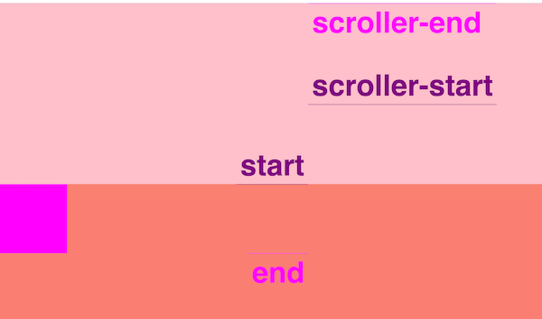
We can now see start, end, scroller-start, and scroller-end markers on the right side of the viewport.
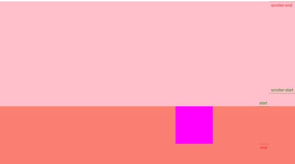
The start marker indicates the top of the trigger element.
Although we haven't explicitly set the end property, we also see an "end" marker. (This is because it defaults to the end of the trigger element).
The scroller-start marker is in the center of the viewport. This corresponds to the second value of center we gave to the start property.
And the scroller-end marker defaults to the top of the viewport.
We also mentioned using percentages and pixel values for the start property.
Let's alter the start values with percentages and pixels to see how the markers are affected.
Instead of top and center, let's use top and 30%.
gsap.registerPlugin(ScrollTrigger);

gsap.to(".square", {
  x: 700,
  duration: 3,
  scrollTrigger: { trigger: ".square", start: "top 30%", markers: true },
});
We can see the scroller-start is positioned 30% down from the top of the viewport.
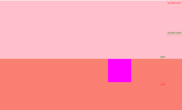
Now, the animation will start when the top of the trigger element reaches that 30% position.
Customizing the Markers
To fine-tune the appearance of the markers, we can use an object rather than a simple boolean value.
In this example, I've altered the start and end colors, font-size, weight, and indent value.
gsap.registerPlugin(ScrollTrigger);

gsap.to(".square", {
  x: 700,
  duration: 3,
  scrollTrigger: {
    trigger: ".square",
    start: "top 30%",
    markers: {
      startColor: "purple",
      endColor: "fuchsia",
      fontSize: "4rem",
      indent: 100,
      fontWeight: "bold",
    },
  },
});
Altering the look of these markers can be helpful in development when experimenting with animations. (Make sure to disable them in production!)
The End Property
Let's explore the end property now.
To illustrate how it works, we'll introduce an additional property called toggleClass.
The class assigned to toggleClass will be toggled on the target element once the trigger element has fired. (We'll set it's value to be a class which we'll create in our CSS).
gsap.registerPlugin(ScrollTrigger);

gsap.to(".square", {
  x: 700,
  duration: 3,
  scrollTrigger: {
    trigger: ".square",
    start: "top 30%",
    markers: true,
    toggleClass: "red",
  },
});
body {
  margin: 0;
}

.div1,
.div2 {
  height: 100vh;
}

.div1 {
  background-color: pink;
}
.div2 {
  background-color: salmon;
}
.square {
  width: 150px;
  height: 20vh;
  background-color: fuchsia;
}
.red {
  background-color: red;
}
Let's comment out the x property and add an end property to the scrollTrigger object.
The end property will set the point at which the scrollTrigger has finished or ended. And, in this case, the square element will toggle back to its background-color of fuchsia.
gsap.registerPlugin(ScrollTrigger);

gsap.to(".square", {
  //   x: 700,
  duration: 3,
  scrollTrigger: {
    trigger: ".square",
    start: "top 30%",
    end: "center 20%",
    markers: true,
    toggleClass: "red",
  },
});
The end property works in the same way as the start property.
It's values can be a:
- number
- string
- function
In our example, when the center of the trigger element reaches twenty percent down from the top of the viewport, the scrollTrigger will be ended.
With our markers set to true, we can see these start and end points.
The start marker aligns with the top of the trigger element.
The end marker aligns with the center of the trigger element.
The scroller-start marker is 30% down from the top of the viewport.
(This corresponds to the second value we gave to the start property).
And the scroller-end marker is 20% down from the top of the viewport.
(This corresponds to the second value we gave to the end property).
So, when the start meets the scroller-start, our square will toggle to red.
When the end meets the scroller-end, the square will toggle back to fuchsia.
Using a Function for the Start Property
Now, let's look at how we can set the values of the start or end properties as a function.
Let's assign an arrow function as the value of the end property and return a template string:
gsap.registerPlugin(ScrollTrigger);

gsap.to(".square", {
  //   x: 700,
  duration: 3,
  scrollTrigger: {
    trigger: ".square",
    start: "top 30%",
    end: () => ``,
    markers: true,
  },
});
Our goal will be to set the end trigger to be 150 pixels from the starting point.
So, in our function, we'll use document.querySelector to get a reference to the div with class of square.
Then, we'll use the offsetHeight property to get the pixel value of that square.
Finally, we'll use the addition assignment operator to assign the offset value to the end property.
gsap.registerPlugin(ScrollTrigger);

gsap.to(".square", {
  //   x: 700,
  duration: 3,
  scrollTrigger: {
    trigger: ".square",
    start: "top 30%",
    end: () => `+=${document.querySelector(".square").offsetHeight}`,
    markers: true,
  },
});
What's cool is that we can now give this height a dynamic responsive value.
For example, instead of setting the square class to have a height of 350px, let's set it to a responsive value of 20vh. (vh is viewport height units)
body {
  margin: 0;
}

.div1,
.div2 {
  height: 100vh;
}

.div1 {
  background-color: pink;
}
.div2 {
  background-color: salmon;
}
.square {
  width: 150px;
  height: 20vh;
  background-color: fuchsia;
}
.red {
  background-color: red;
}
Now, when the height of the viewport changes, the ScrollTrigger's endpoint will update itself to the current height of the square.
Conclusion
In this article, we learned about ScrollTrigger's start and end properties.
We learned how to use an object as the scrollTrigger property's value to access additional properties.
We also saw how we could use markers to get a visual representation of the start and end points.
If you're more of a visual learner, check out the video version of this article: