How to Change CSS Background Image Opacity [But Not the Text!]
![How to Change CSS Background Image Opacity [But Not the Text!]](/_next/image?url=%2Fimages%2Fblog%2Fhow-to-change-css-bg-image-opacity%2Fhow-to-change-bg-image-opacity-tutorial.jpg&w=3840&q=75)
Introduction
Have you ever had that annoying situation where you can't get your foreground text to contrast enough with your background image?
So what do you do? Well, you probably come into the CSS rule that holds the background image and try lowering its opacity.
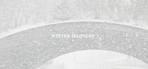
But then, lo and behold, you notice that the foreground text opacity has also been reduced. 😠
Let's figure out a solution to this common conundrum!
Why Does This Problem Occur?
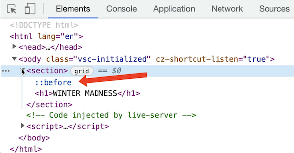
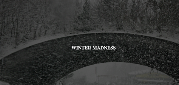
Notice in the HTML for this example that the h1 is nested inside the section element.
<body>
<section>
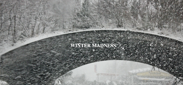
<h1>WINTER MADNESS</h1>
</section>
</body>
The problem occurs because this h1 inherits its opacity from the CSS rule for the section.
So, in the CSS, when we lower the section element's opacity, we're also lowering the opacity of the h1.
section {
  height: 100vh;
  display: grid;
  place-items: center;
  background-image: url("images/pexels-magda-ehlers-714482.jpg");
  background-size: cover;
  opacity: 0.3;
}

h1 {
  color: #fff;
}
Therefore, we need to sever this inheritance connection!
Finding the Solution With Pseudo-Elements
To solve this problem, let's work on putting those background image properties onto a pseudo-element. (pseudo-elements allow you to style specific parts of an element).
We'll use the before pseudo-element and apply it to the section rule. The before pseudo-element will act as the first child element of the section.
Let's set it to have a content property with the value of an empty string.
section {
  height: 100vh;
  display: grid;
  place-items: center;
  background-image: url("images/pexels-magda-ehlers-714482.jpg");
  background-size: cover;
}

section::before {
  content: "";
}

h1 {
  color: #fff;
}
We can see that pseudo-element in Google Chrome's developer console.
Now, let's take the background image properties off the section element and put them on the before pseudo-element.
section {
  height: 100vh;
  display: grid;
  place-items: center;
}

section::before {
  background-image: url("images/pexels-magda-ehlers-714482.jpg");
  background-size: cover;
  content: "";
}

h1 {
  color: #fff;
}
Sizing and Positioning the Pseudo-Element
Before we can see this pseudo-element in the viewport though, we'll need it to fill out the width and height of the parent section element. To accomplish this, we'll give it a position: absolute.
section::before {
  background-image: url("images/pexels-magda-ehlers-714482.jpg");
  background-size: cover;
  content: "";
  position: absolute;
}
Typically, an element with position: absolute, needs to be set it in relation to a parent element. Since we want to set it in relation to the section element, we'll give the section rule a position: relative.
section {
  height: 100vh;
  display: grid;
  place-items: center;
  position: relative;
}
Now, we need to define our top, right, bottom, and left settings for this absolutely positioned pseudo-element.
To do this all at once, we can use the inset property and set it to a value of zero.
section {
  height: 100vh;
  display: grid;
  place-items: center;
  position: relative;
}

section::before {
  background-image: url("images/pexels-magda-ehlers-714482.jpg");
  background-size: cover;
  content: "";
  position: absolute;
  inset: 0;
}
Now you'll see the background image magically appear in the viewport! ✨✨✨
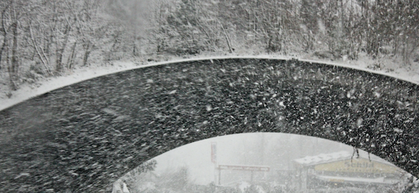
But hold on...don't get too excited just yet. Where's the h1? 🤔
Creating a Stacking Context for the H1 Text
The h1 is currently getting hidden in the stacking order. This is because the section and section::before pseudo-element have their positions set to relative and absolute.
Fortunately, we can remedy this with a handy property called isolation.
If we set isolation, on the h1, to have a value of isolate, we can create a new stacking context. That will get the h1 out in front of those other elements.
h1 {
  color: #fff;
  isolation: isolate;
}
And now, with the h1 visible, we can lower the opacity of the background image independently from the text.
Also, in the section rule, setting a background color of black(#000) helps improve the contrast between background and foreground as the pseudo-element's opacity is lowered.
section {
  height: 100vh;
  display: grid;
  place-items: center;
  position: relative;
  background-color: #000;
}

section::before {
  background-image: url("images/pexels-magda-ehlers-714482.jpg");
  background-size: cover;
  content: "";
  position: absolute;
  inset: 0;
  opacity: 0.4;
}

h1 {
  color: #fff;
  isolation: isolate;
}
Experiment by tweaking the opacity value in the pseudo-element and the background color value in the section element to taste.
If you're more of a visual learner, check out the video version of this article: